Making responsive Vue components with ResizeObserver
Hello guys! Today I want to share a little but very useful thing.
On my current project, I have a lot of reusable components (I named it “widgets”) that can be placed anywhere. And I ran into a problem with responsive design.
Finally, I understood that css @media queries are absolutely unusable in my case.
So, what’s the problem?
Imagine that we have some PostsItem component. We have PostsPage with list of posts:
Just a few lines of CSS, right?
.post__item {
  display: flex;
}

.post__image {
  flex: 0 0 200px;
  height: 200px;
}
2
3
4
5
6
7
8
And, we also want to keep mobile view OK. It may look like:

You can say “easy”, @media solves this problem, right?
OK, it works. But what if we’ll use our PostsItem component in another place?
Oh, poor eyes. Our screen is large but we didn’t expect to see 3 posts in a row.
So, the biggest problem of @media queries is:
Your component responsiveness is based on the screen size but should be based on its own size
But, in this case, component layout depends only on them. These components should be atomic, independently determine their own size and adapt the layout to it.
We need local responsive styles. And here comes ResizeObserver!
ResizeObserver
ResizeObserver is a new feature that allows you to be notified when an element’s content rectangle has changed its size, and react accordingly.
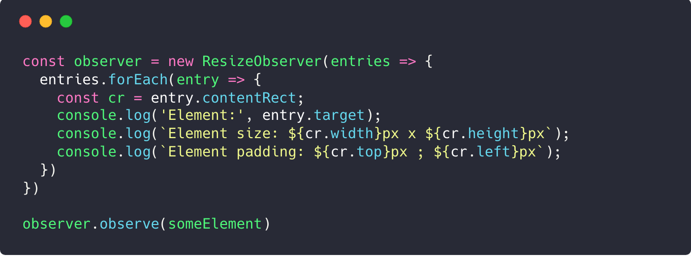
Usage is stupidly simple:
const observer = new ResizeObserver(entries => {
  entries.forEach(entry => {
    const cr = entry.contentRect;
    console.log('Element:', entry.target);
    console.log(`Element size: ${cr.width}px x ${cr.height}px`);
    console.log(`Element padding: ${cr.top}px ; ${cr.left}px`);
  })
})

observer.observe(someElement)
2
3
4
5
6
7
8
9
10
You can say that browser support is not OK:
But, fortunately, ResizeObserver has polyfill that’s based on MutationObserver:
Using with Vue
I made a small ResizeObserver wrapper for Vue.js (also works on Nuxt.js) that allows you to easily deal with responsive components:
<template>
  <Responsive :breakpoints="{ small: el => el.width <= 500 }">
    <div slot-scope="el" :class="['post__item', { small: el.is.small }]">
      <img class="post__image" :src="post.image" />
      <div class="post__text">{{post.text}}</div>
    </div>
  </Responsive>
</template>

<script>
  import { Responsive } from "vue-responsive-components"
  export default {
    props: ['post'],
    components: { Responsive }
  }
</script>

<style lang="scss">
.post__item {
  display: flex;
}

.post__image {
  flex: 0 0 200px;
  height: 200px;
}

.post__item.small {
  flex-direction: column;

  .post__image {
    flex: 0 auto;
    height: auto;
  }
}
</style>
2
3
4
5
6
7
8
9
10
11
12
13
14
15
16
17
18
19
20
21
22
23
24
25
26
27
28
29
30
31
32
33
34
35
36
And now it looks fine even when we put 3 posts in a row:
Now, our component is truly independent!
It also gives you opportunity to define different html markup too rather than css only. For example, I added tabs and “extra small” post view for small-sized block:
Also, I want to point that I totally removed all @media queries from my current project in favour of ResizeObserver 😉
UPD: Bonus: v-responsive directive
Thanks to this guy for an idea. I added v-responsive directive to get rid of wrapper component:
<template>
  <!-- Will add/remove .small if the width is less / greater -->
  <div class="post__item" v-responsive="{ small: el => el.width <= 500 }">
    <img class="post__image" :src="post.image" />
    <div class="post__text">{{post.text}}</div>
  </div>
</template>

<script>
import { ResponsiveDirective } from "vue-responsive-components"
export default {
  props: ["post"],
  directives: {
    responsive: ResponsiveDirective
  }
}
</script>
2
3
4
5
6
7
8
9
10
11
12
13
14
15
16
17